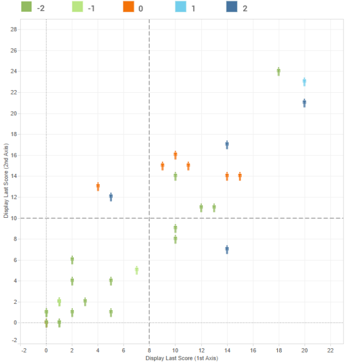
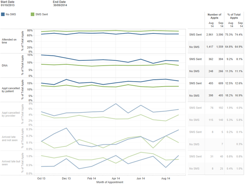
Your data is trying to tell you something
Something that could radically change the way you deliver your service.
Something that could make your service more efficient and effective.
Something that could change – even save – lives.
But without analytics expertise, your healthcare data is nothing more than a set of characters on a page.
Mayden Analytics is a new service that will unlock the information buried within your datasets, revealing valuable insights, patterns and anomalies that would otherwise simply be hidden.
Working with our team of experts will ensure that you don’t just see, but truly understand your healthcare data. As well as providing custom dashboards that let you look at your data from every angle, so you don’t miss a thing.
Fast and economical. You simply can’t afford not to.
- indispensable
- visual
- easy, fast, affordable
Healthcare Data
Trapped within your data is an extraordinary amount of information that could help your service run both more efficiently and more effectively.
Leveraging the information within your healthcare data will allow you to learn from the past, identify trends and patterns in patient care, predict pathways, and shine a light on the ways that you can adjust your service to deliver better quality care at lower time and financial costs.
In short, better understanding of your healthcare data amounts to better outcomes for your patients.
Mayden Analytics Experts
Mayden Analytics cuts through the figures and presents to you the simple truths behind the numbers using beautiful, clear, presentation-quality visuals.
Our team of analytics experts are on hand every working day to provide you with guidance and information. They’ll build a dashboard tailored for your needs, which will allow you to keep an eye in real time over the aspects of your service that are most important to you.
Do you want further detail on a specific metric? Or are you interested in previously unexplored trends? Simply contact us via phone or email. Our experts will create presentation-quality graphics and interactive tools and models for you to examine and to share in presentations and reports.
You can use the service to:
- Improve effectiveness and increase efficiency
- Predict patient pathways and respond to potential issues before they arise
- Identify and respond to areas of low and high patient satisfaction
- Improve administrative and financial performance
BENCHMARKING
Mayden Analytics also gives you the opportunity to go beyond the limits of your own data. Our vast library of look-up tables allows us to combine patient activity with population and demographic information, and other publicly available datasets.
With access to anonymous big data from multiple external sources we’ll help you see your place within the global picture.

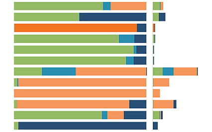
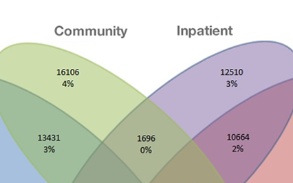
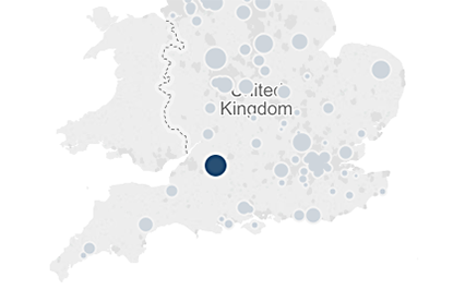
Mayden Analytics presents to you the simple truths behind the numbers, with clear, stunningly crafted, presentation-quality graphics that allow you to see your data from every angle.
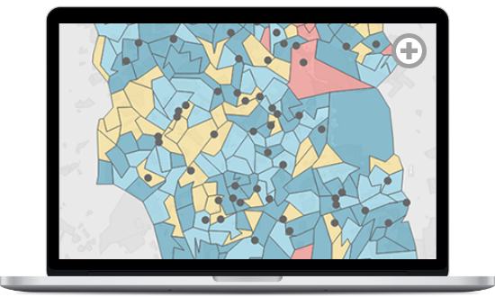
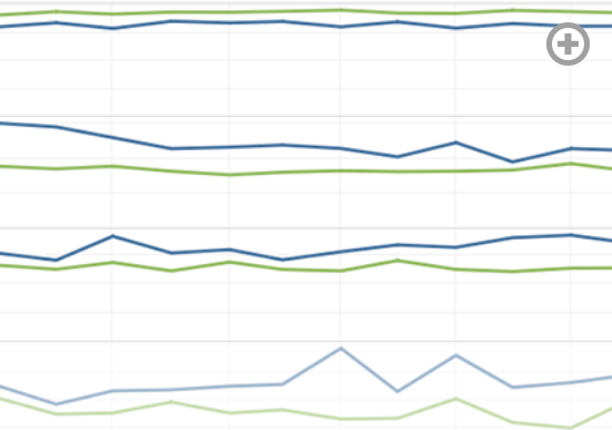
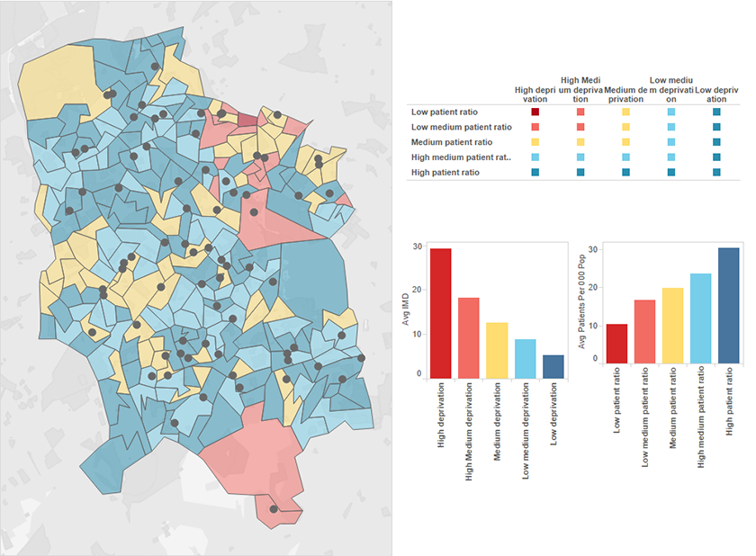
From bubble charts, to maps, to interactive infographics, the service raises your visualisations beyond the standard mix of pie charts and graphs.
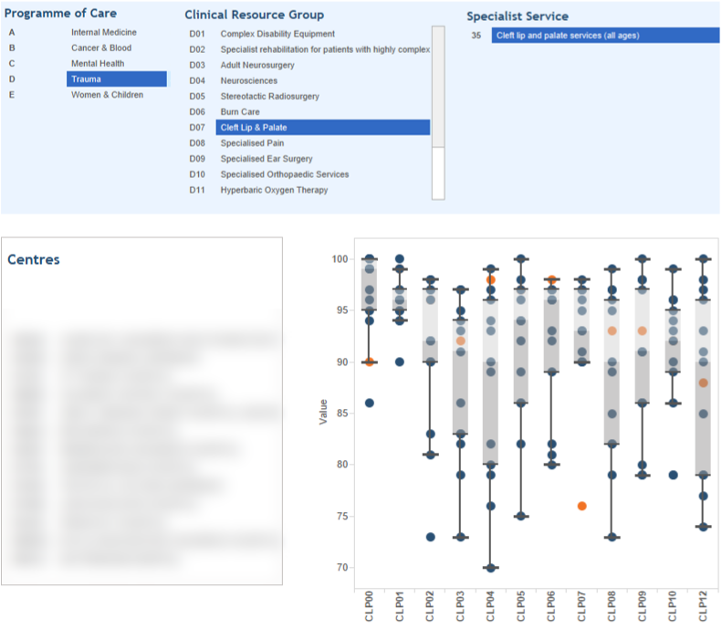
We’ll even produce bespoke, interactive dashboards that allow you to take in a birds-eye view, and then drill down to show details.
Mayden Analytics visuals are created in Tableau, a leader in G2’s recent rankings as well as in the Magic Quadrant for Business Intelligence and Analytics Platforms report 2015, and a world-leading premier business intelligence and data visualisation tool.
Mayden Analytics is fast. Really fast. It handles millions of records at once to produce real time, relevant results. The service is both more agile and more economical than hiring an internal analyst.
You’ll be able to use Mayden Analytics in conjunction with any of your existing Mayden products, or as a stand-alone program to interpret any dataset.
Because you’re working with Mayden, you can be certain your data is secure and in the hands of healthcare and analytics experts. Read more about our service here.
To get started, you’ll simply share your data with our team of experts. We’ll work with you to establish the best inroads to the information you seek. Soon after, you’ll receive this information presented as stunning, presentation quality graphics that tell a clear story.
To benefit from the Mayden Analytics and find out just how affordable the service can be, simply get in touch.
