Think you know your services inside out? Think again. Do you really understand what your data is telling you? Perhaps not as much as you thought. With so much data at our disposal these days it can be hard to see the wood for the trees and digging into data often just raises more questions. Just what do you analyse? How do you interpret what you see? How do you go on to use it to make a case for change or investment? We can help and guide you through the data maze…
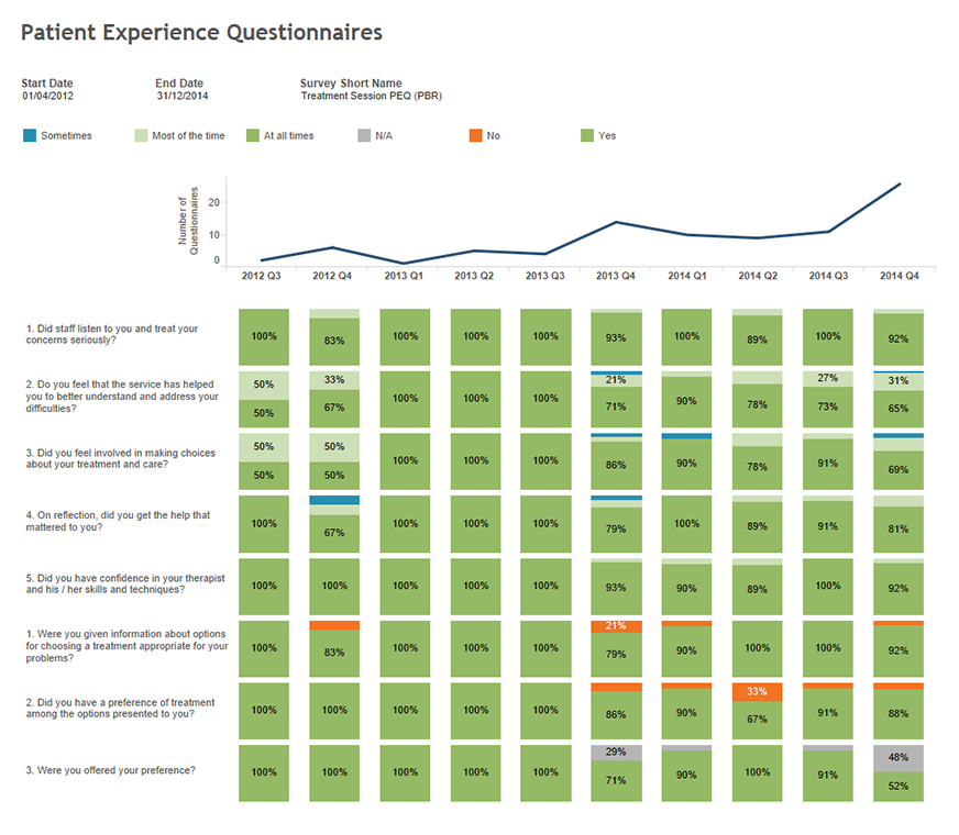
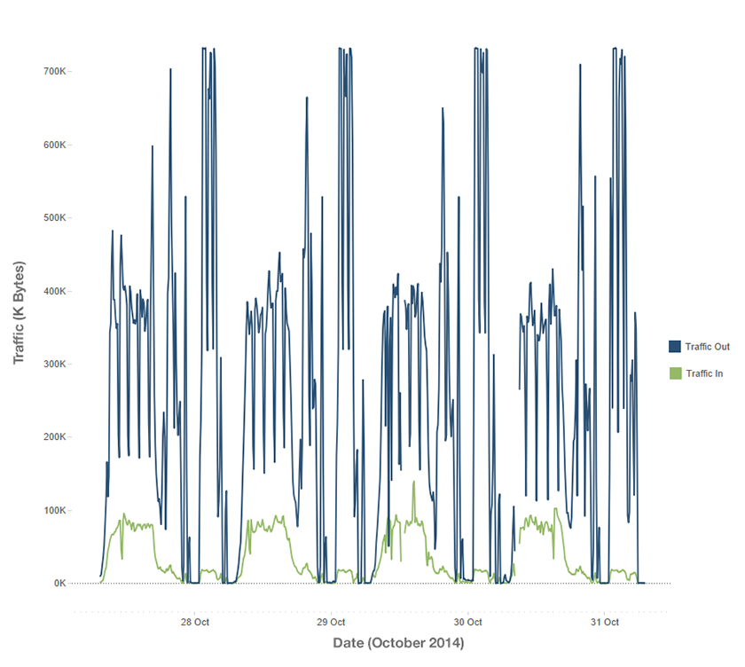
Mayden Analytics is a powerful service that converts complex healthcare data into stunning, engaging, presentation-quality graphics that communicate the facts with clarity. These insights have the potential to transform how care is delivered.
To create these powerful graphics, Mayden’s team of analytics experts use a premier business intelligence data visualisation tool called Tableau.
In developing the Mayden Analytics service we found that Tableau was the only solution with the ability to create all of the the results we desired from our test data. In addition to presenting the information simply and beautifully, Tableau allows us to work extremely quickly and is very versatile, offering a wide range of visualisation types. Best of all, it even allows us to create live dashboards which providers can use to monitor their services in-house, in real time.
Healthcare trusts generate huge volumes of data, but don’t always have the in-house expertise to process and understand their data to the fullest extent. Mayden Analytics offers affordable expertise to healthcare teams, empowering them to make better-informed, fact-based decisions.
“Productivity is essential for healthcare organisations,” explains Mayden’s MD, Chris May, “and with Tableau at our disposal we can deliver our clients’ healthcare data results more quickly, with an output that is extremely high quality.


 Chris M is the founder and managing director of Mayden. He has 21 years of experience in the healthcare industry, where he worked as a hospital manager and later as a management consultant specialising in information analysis and modelling.
 Chris E is Mayden‘s director of operations and has been with the company since 2009. He has a background in mechanical engineering, and studied at postgraduate level at Cambridge University.
 Coralie has a first class bachelors degree in cybernetics and control engineering as well as a masters degree in biomedical engineering. She has ten years’ experience in IT and software development.
 Juliette is our in-house Tableau specialist. She has 20 years experience in health analytics, and has worked for NHS Trusts, a leading health management consultancy as a freelance analyst.
 Alison is a director at Mayden and oversees organisational development, business development and marketing. Having started her working life as a graduate General Management Trainee in the NHS, she went on to hold a number of operational and strategic management positions in acute and community sectors before moving into management consultancy with one of the UK’s leading specialist healthcare consultancy firms.
